
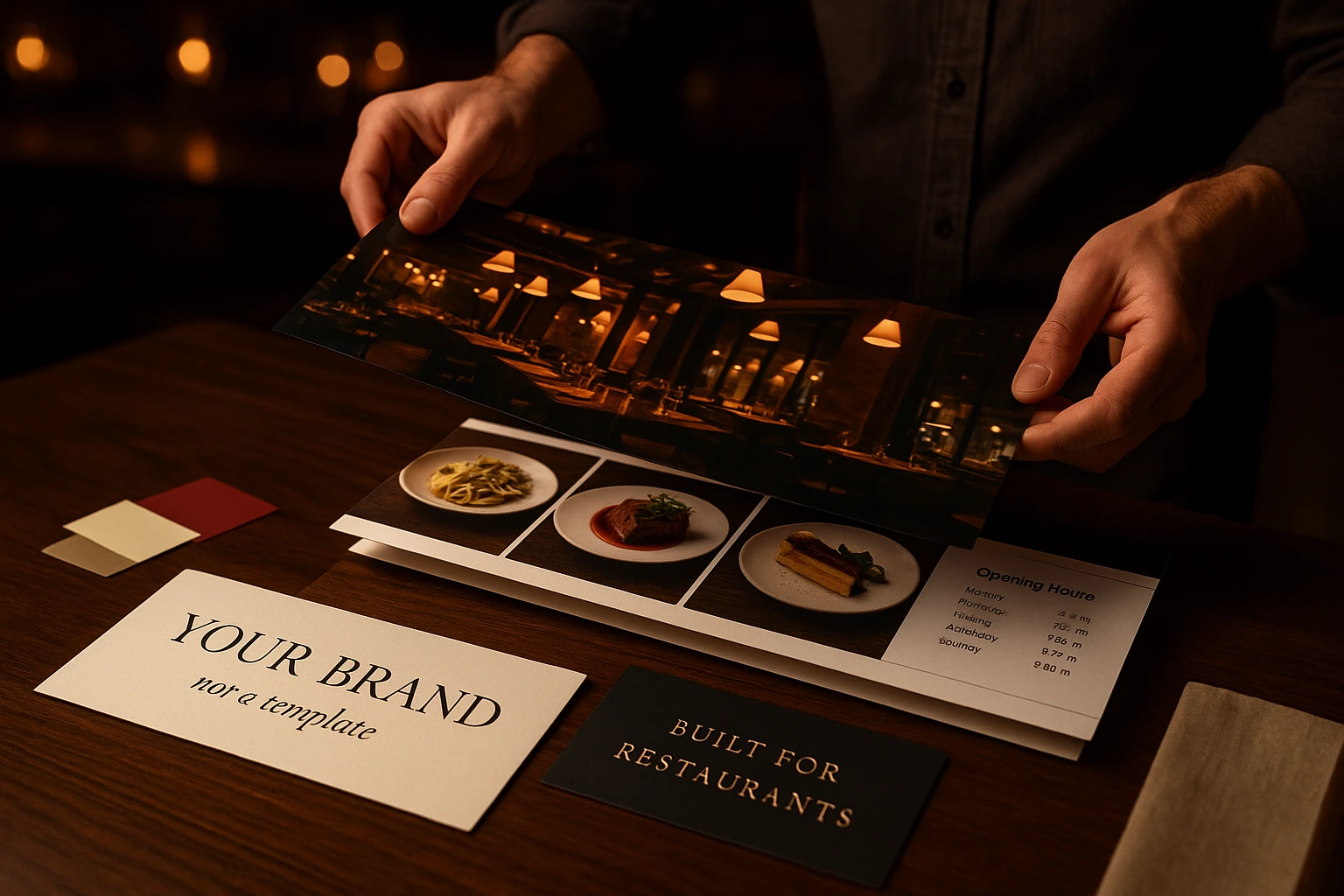
Build the Website Your Restaurant Deserves — Without a Designer, an Agency, or a Retainer
Stack full-width sections, drag them into the order you want, and publish. Every section is built for restaurants: menu sliders, offer carousels, photo mosaics, location cards, opening hours, reservation forms. Your fonts, your colours, your brand — running on the same platform that takes your orders.
What Is the Restaurant Website Builder?
Most website builders are built for everyone, which means they are built for no one. You get a blank canvas, a text box, and a bill from whoever you hired to fill it. Then you paste your menu in as a PDF, it goes stale in a week, and your prices are wrong in two places. We build for restaurants only. That is why a section here is not an empty rectangle — it is a product slider that reads your real menu, a locations grid that knows your branches, an opening-hours block that reads your actual schedule. You choose what a section shows. You never retype what the platform already knows.
A page is a stack of full-width sections. You add one from a visual list, set a handful of options, and drag it where you want it. There is no canvas to get wrong, no columns to break, and nothing to lay out twice for phones — every section sizes itself to whatever space it has, so a page that looks right on a laptop looks right on a phone without you touching it. Your site and your ordering menu share the same fonts, colours and button shapes, so a customer moving from your story to your menu never feels handed off to a different company.
Why Restaurants Choose It
Your Menu Is Never Out of Date
Change a price once. Your website, your ordering menu, and every section that shows products update together. No PDF to re-export, no second place to remember, no customer arriving with last month's price in their head.
Change It Yourself, in Minutes
New seasonal menu on Thursday? Add a product slider, pick the category, drag it above the gallery, done. No agency ticket, no waiting until Monday, no invoice for a text change.
Customers Order From You, Not Around You
Your site and your ordering flow are one product. Every button leads into your own checkout, your own customer list, your own repeat business — instead of handing the relationship to someone else's app.
Found by Google, Readable by AI
Sitemaps, structured data, Open Graph previews and multi-language tags are generated for every page automatically. Most restaurant sites we replace have none of it — which is why they never rank for their own name plus 'menu'.
How It Works
Pick a Starting Point
Choose the shape that matches you — delivery-first, classic restaurant, fine dining, café, or a chain with several branches. Your pages arrive already filled with sensible sections and your own data. Nothing starts empty.
Add and Arrange
Open a page and you see its sections in one column. Add from a visual list, drag to reorder, hide one for a week without deleting it. A live preview sits beside the list, so you see the change as you make it.
Point Each Section at Your Data
A slider needs to know what to show: this category, these six dishes, your gallery, your branches. Pick it once. From then on the section keeps itself current as your menu changes.
Publish on Your Own Domain
Connect your own web address, or use the one we give you. Sitemaps, search previews and language tags are generated for you. Your ordering menu is already there — same site, same brand, same checkout.
What You Can Build
Sliders That Actually Work — Eight Sources, Three Framings
One slider section, and you choose what rides in it: promo banners, hand-picked products, a whole category, your most popular dishes, your discounted items, gallery photos, upcoming events, or your branch locations. Then choose how it sits on the page — contained, edge-to-edge full bleed, or a centred slide with the next one peeking in at the sides. It drags with a mouse, swipes on a phone, moves with arrow keys, loops at the end, and can advance on its own. It shows how far along you are. It pauses when someone hovers over it, and stops entirely for visitors who have asked their device for less motion.
- Put your Friday offer at the top of the page in under a minute
- Show a category that fills itself — new dishes appear without touching the site
- Full-bleed photo carousels for the story, tight product carousels for the sell
- Works with a mouse, a thumb, or a keyboard — nothing feels broken
Sections Built for Restaurants, Not Blogs
Seven section types cover every restaurant page we have ever had to build: a full-bleed hero with image or video, a collection (that slider, plus grids and staggered photo mosaics), text with a photo for your story pages, a row of buttons, opening hours with an address and a map, an embedded reservation form, and an FAQ that answers the questions your phone keeps ringing about. Each one comes as a ready-made preset with a picture of the result, so you pick what you want to see, not what it is called underneath.
- Category tiles that link straight into the right part of your menu
- Photo mosaics that make a small gallery look considered
- Opening hours that read your real schedule — never wrong, never edited twice
- A reservation form that fills itself in from your booking setup
Your Brand, Not a Template
Set your page background, text colour, heading font, body font and button shape, and every section follows. Upload your own brand font files if your identity depends on a typeface nobody else has — we serve them from our own network, so your site never depends on a host you left behind. You can extend the same look to your ordering menu with one switch, or leave the menu exactly as it is. Because sections read colour from your brand instead of hard-coding it, one site can be black and serif and another cream and rounded, running the same code.
- Two restaurants, one platform, zero family resemblance
- Your own licensed fonts, hosted by us, loaded fast
- Menu can match the site — or stay standard, your call
- Change a colour once, watch every section follow
Pages for the Things That Make You Different
Your restaurant is not a menu and a contact form. It is a chef, a room, a Thursday DJ, a tasting menu, a story about why the recipe travelled. Create as many pages as you need — each with its own web address, its own title and description for Google, and its own share preview. Then put them in your navigation and your footer with a drag. Multi-language is built in: every heading, paragraph and button label is entered per language, so every visitor reads their own language — Bulgarian, Greek, Turkish, or English — on the same page.
- A page per story, each with its own address Google can index
- Events, tasting menus, private dining — all first-class pages
- Every language entered properly, never machine-guessed at the last minute
- Reorder your navigation without touching a developer
Built for Real Restaurant Situations
The Seasonal Menu Launch
Autumn menu goes live Thursday. You add a product slider pointed at the new category, drag it to the top, and publish. Anything you add to that category later shows up on its own — no second edit, no forgotten page.
The Restaurant That Is Also a Story
Your cuisine has a history worth telling, and it sells. Build a page of alternating text and photography, give it its own address, and link it from the main navigation. Google indexes it as its own page instead of burying it in your homepage.
The Chain With Three Branches
One website, one basket. A locations section reads your branches straight from the platform, and the order routes to whichever branch actually serves that address. Open a fourth branch and it appears on the site without anyone editing it.
The Friday Offer
A promotion that runs this weekend and then stops. Add a banner slider, schedule it, and forget it. It shows on Friday and disappears on Monday without anyone remembering to take it down.
The Site You Are Moving Off
You have a site you like the look of and an agency you no longer want to pay. Bring the same structure across — the sections exist for exactly the layouts restaurants use — keep your fonts and photography, and add the ordering, reservations and menu that were missing.
The Photograph-First Room
Your dining room does the selling. A full-bleed hero, a staggered photo mosaic and a booking block are three sections and about ten minutes — and every image is sized and lazy-loaded properly, so the page still opens fast on a phone in a car park.
Restaurant Website Builder — Full Overview
General-purpose website builders treat a restaurant like a brochure. You get a blank page and a text box, and your menu ends up as an image or a PDF that nobody updates. Within a month the prices on your website disagree with the prices at your door. A restaurant website builder starts from what a restaurant actually publishes: a menu that changes, dishes that sell out, opening hours that shift for holidays, branches that open, offers that run for a weekend. Every section in Ordering.Tools reads that live data instead of asking you to retype it.
Why Restaurants Need a Different Kind of Website Builder
The second difference is that a restaurant website has a job beyond looking good. It has to take the order. When your website and your ordering system are separate products, every customer crosses a seam — a different design, a different login, sometimes a different company. Each seam loses people. Here the story pages, the menu, the basket and the checkout are one site with one brand, so a visitor reading about your chef is two clicks from paying you directly.
What You Can Actually Build
A page is a vertical stack of full-width sections. Seven types cover the ground: a hero with a photograph or video; a collection that renders as a slider, a grid or a staggered mosaic and can be fed from promo banners, products, categories, gallery albums, events, locations or reviews; text with a photograph for story pages; a row of action buttons; an opening-hours and contact block with a map; an embedded reservation form; and an FAQ accordion. Those combine into roughly fourteen ready-made presets, each shown as a picture of the result so you choose by what it looks like, not by what it is called. Sliders drag, swipe, loop, autoplay, show progress and respond to arrow keys, and every section resizes itself to the space it is given — there is no separate mobile version to build or forget.
Brand, Languages and Being Found
Your background colour, text colour, heading font, body font and button shape flow into every section, and you can extend the same look to your ordering menu with a single switch or leave the menu standard. Commercial brand fonts can be uploaded and are served from our network, so a migrated site depends on nothing from wherever it used to live. Every piece of text is entered per language, so nothing is machine-translated at the last minute or left in the wrong one. And every page publishes with a sitemap entry, structured data, a share preview and language tags — the parts most restaurant sites are missing, and the reason they do not appear when someone searches their own name next to the word menu.
Your Site and Your Orders, One Platform
Stop paying for a website that cannot take an order and a menu that goes out of date. Build both in one place.
Related features
Other tools restaurants use alongside this one.
Tourists scan your QR code and see the menu in their own language. No waiting for staff to explain. No pointing at pictures. They order confidently and spend more. We translate your menu for you.
Learn moreEvery anonymous order is a missed relationship. Customer accounts let you know who orders, what they love, and how to bring them back.
Learn moreMaterialized RFM scores, lifetime stats, normalized tags, append-only notes, allergen + dietary preferences, GDPR consent audit, double opt-in, and global delete with grace period — all built into your ordering platform. No external CDP, no extra subscription.
Learn moreVerify customer phone numbers with a one-time SMS PIN — once per number. Reduce fake orders, improve delivery accuracy, and build a trusted customer base.
Learn more